“A responsive website adjusts to various screen sizes, not only giving a consistent experience across platforms but also eliminating the need for a separate mobile site. Streamlining website maintenance saves time and resources, allowing you to invest in other areas without sacrificing excellence.” – Mark Neal, C. Grant & Company, Integrated Research, Strategy and Marketing
In years past, desktop devices were the most popular tools used in conducting Internet searches. Desktop web designs took front row seats ahead of mobile design, and many never believed they would see a day when PC/laptop use for online searches would fall to smaller, handheld devices. Now, with the explosion of smartphone and tablet Internet use, it is no longer a question of designing a website simply to get your message across to visitors – now it is more about designing your website to fit the growing needs and demands of those visitors and the avenues they’re using to access your online content.
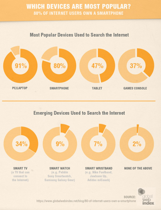
Let’s take, for instance, this infographic on Most Popular Devices Used in a recent report by Smart Insights:
The closeness in use of PC’s and laptops to conduct online searches (91 percent) compared to smartphones (80 percent) is startling, to say the least. Add to that the growing number of emerging devices and you’ve got yourself a recipe for a point of no return – the way in which people are accessing online information is forever being altered by the various – and growing – options they now have to get the information they need. According to a Pew Research Center report, almost 35 percent of Americans say they access the Internet primarily through the use of a mobile device. Karen McGrane of Harvard Business Review said in The Rise of the Mobile-Only User that marketers and web designers do not get to choose which device customers use to access the Internet but instead, it is our responsibility to deliver the same experience to them across whatever device they choose. With this rise in alternate access points comes the need for an integrated, multi-screen-adapted Internet viewing experience.
Enter Responsive Web Design (RWD).
Web Developer John Polacek offers a simple definition of RWD as “websites that respond to their environment,” or, rather, websites that are built with the capability to automatically adapt to whatever screen size a user is viewing the site on. A good starting place with RWD, is designing with a mobile-first approach. A more effective experience can be had by enhancing your site for each device instead of starting with desktop design and trying to edit your website to fit mobile.
At the end of this month, RWD will become even more important to marketers when Google’s new mobile-friendliness search algorithm launches, rewarding in rankings those websites that are fully optimized for mobile platforms.
While brands everywhere should be feeling the pressure to adapt their online presence to RWD, no field has seen quite as many benefits from the trend as that of higher education institutions.
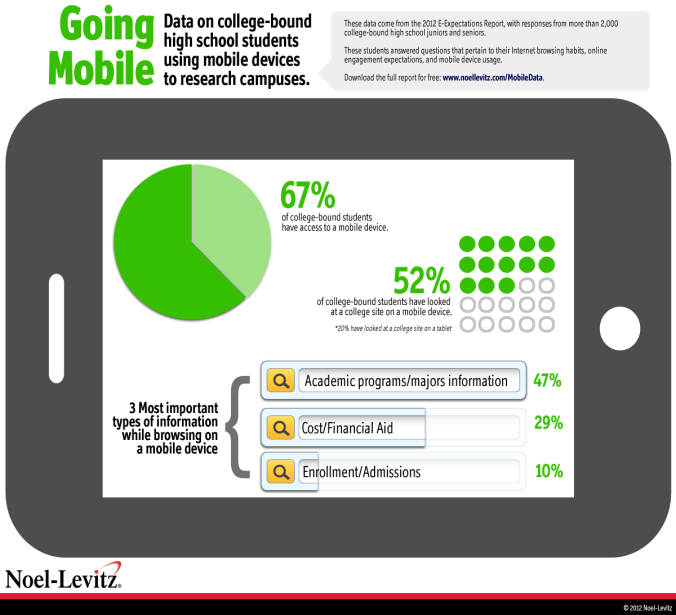
Admissions recruiting has never so heavily had to rely upon, not only the aesthetics of an online presence but the usefulness of it as well. According to research from Edison in 2013, more than 75 percent of people, ages 18-24, own smartphones, and 75 percent of teens – a prime demographic for undergraduate institutions of higher learning – are more apt to use devices other than desktops to go online. In addition, an annual report from the Higher Education Research Institute at UCLA in 2013, revealed that 97 percent of students visited a college’s website on mobile, and most of those students didn’t find the experience satisfying. At a minimum, colleges and universities should be optimizing pages such as academics, cost and aid and admissions for mobile usage.
Mark Neal of C. Grant & Company writes in Responsive Websites: Four Reasons Why Universities Should Make the Switch, that responsive web design “gives prospective students, parents, and potential donors alike the best user experience possible on your website. A responsive website maximizes the impact of your institution’s web presence across multiple platforms.” College and Universities that have made the leap to utilize RWD have opportunities to shine a light on their ability to adapt to the changing times by delivering exactly what their target audience needs while other brands are still struggling to catch up.
Here are four higher education institutions that are getting – and in some instances, have been getting – responsive web design right.
#1. Sewanee – The University of the South
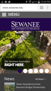
Sewanee’s mobile site is a mini version of its desktop design. In fact, if it weren’t for the mobile-friendly menu located at the very top of the smartphone-adapted design (which makes up for the missing horizontal, top-of-page navigation), you might not even be able to tell the difference, the experience is so seamless. Sewanee’s RWD is definitely a mobile-first creation, with a focus on content. When clicking on the smartphone-adapted version of the site, the first few options are “Academics” and “Admissions and Financial Aid,” a few of the most important searches to prospective students visiting a college website for the first time. The load time for Sewanee’s mobile site is impressive, especially considering the large flashing banner images, and is a testament to the benefits of RWD.
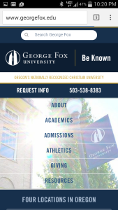
Though George Fox University in Oregon may have one of the most interesting desktop sites, utilizing video in place of its banner image, the schools mobile-ready site is what is under investigation here. The smartphone enabled site offers a variety of options right away for vertical viewing – including the school’s contact information at the top of the site and a menu built into the main body. The most interesting part of the George Fox RWD is that the mobile experience changes as soon as you flip your device to horizontal viewing. In horizontal mode, the site looks entirely similar to the desktop version. Besides its considerate menu in vertical mode, the mobile-ready site next lists tabs for the satellite locations of the university, followed by upcoming events and news.
#3. Regent College
Regent College, a Canadian-based institution, has a very clean and modern-looking desktop design, with large, colorful tabs and high-quality photography. Like Sewanee’s site, Regent’s mobile-optimized sites are a mini version of the larger desktop site. With the bold tabs splayed across the top of the mobile-ready site and easily digestible blocks of content viewable upon scroll, Regent’s RWD may be the most polished so far.
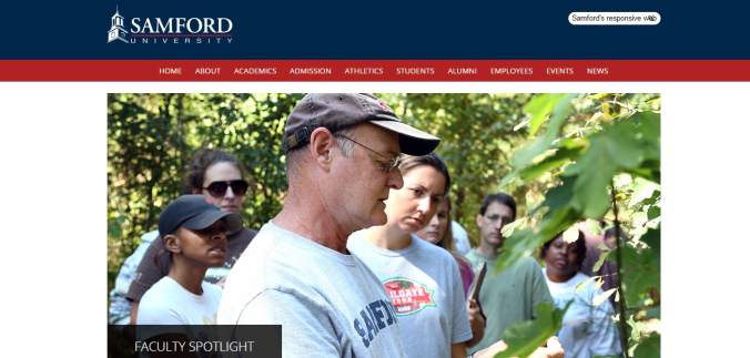
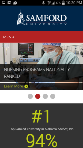
Samford University in Alabama shows that content is top focus with their RWD. The mobile-ready site mirrors the desktop site but offers a few different pieces of content compared to the other institutions featured here – including a homepage section on interesting, eye-catching, infographic-style facts and figures about the university. This design is the only one of the four that utilizes more images in its RWD, and though this creates more of a need to scroll for a longer period of time, the images add more personality to the design.
These are just a choice few of the hundreds of colleges and universities taking steps to create great responsive web designs. Can you think of any higher education institutions that have fallen behind in the mobile-ready game?
